


CHEW LIFE LAB. |Branding
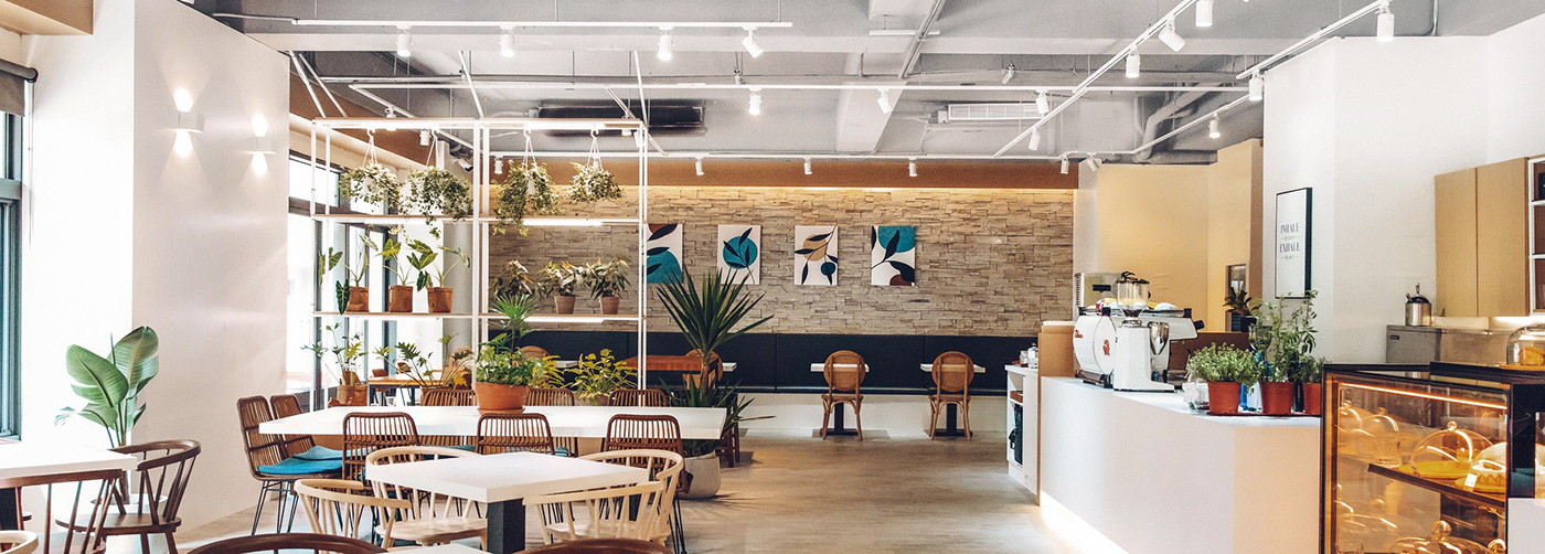
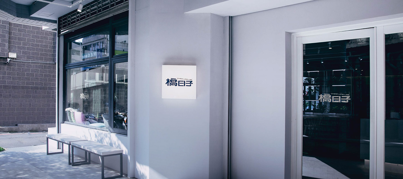
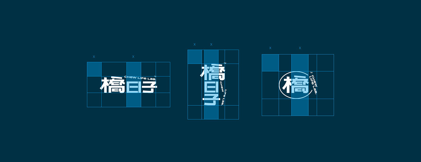
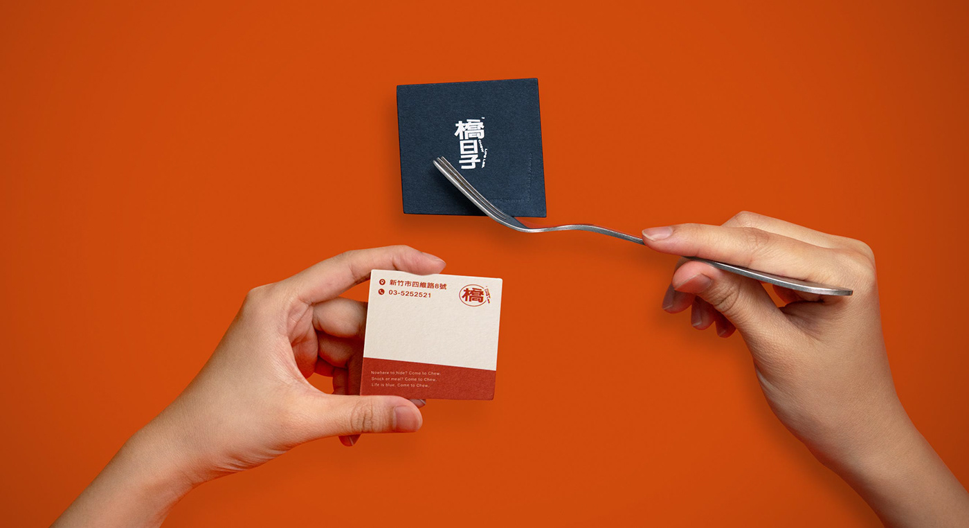
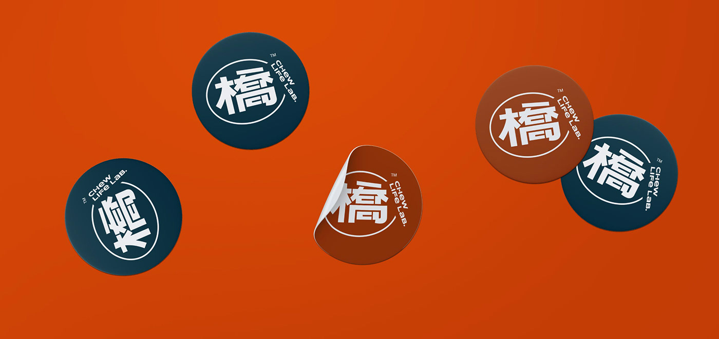
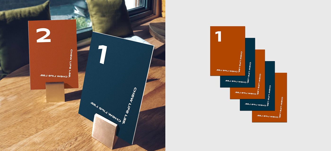
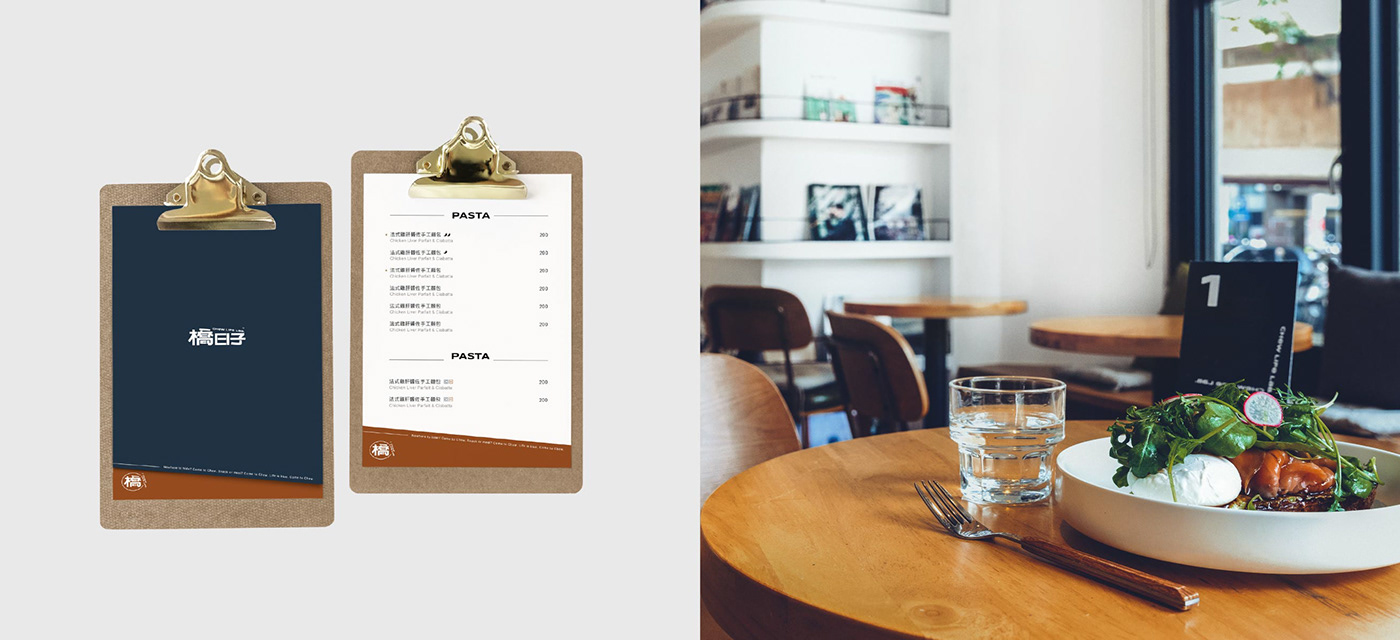
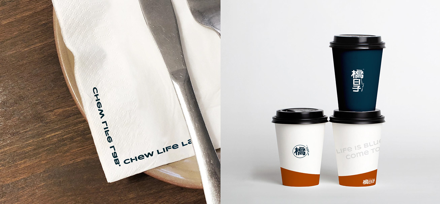
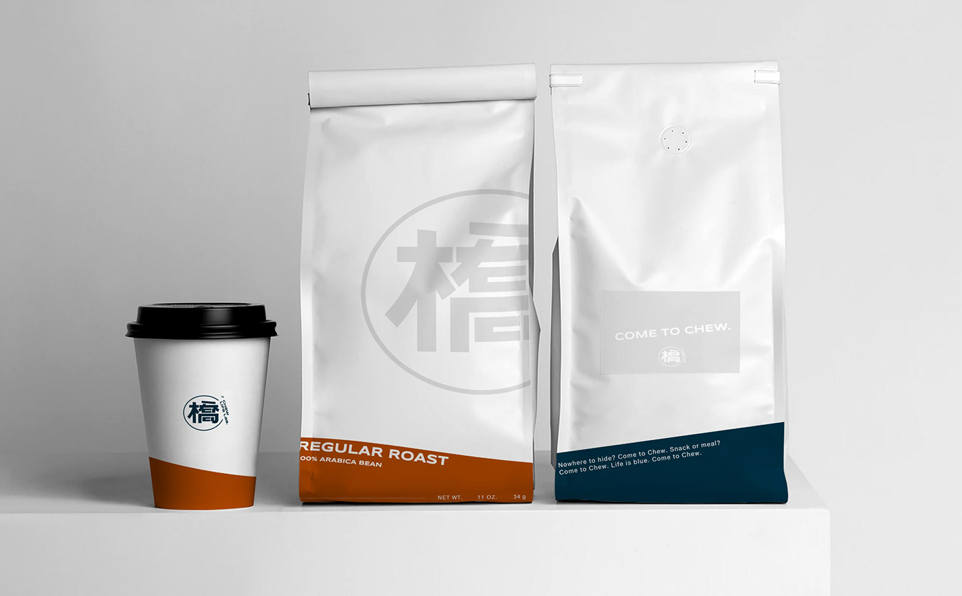
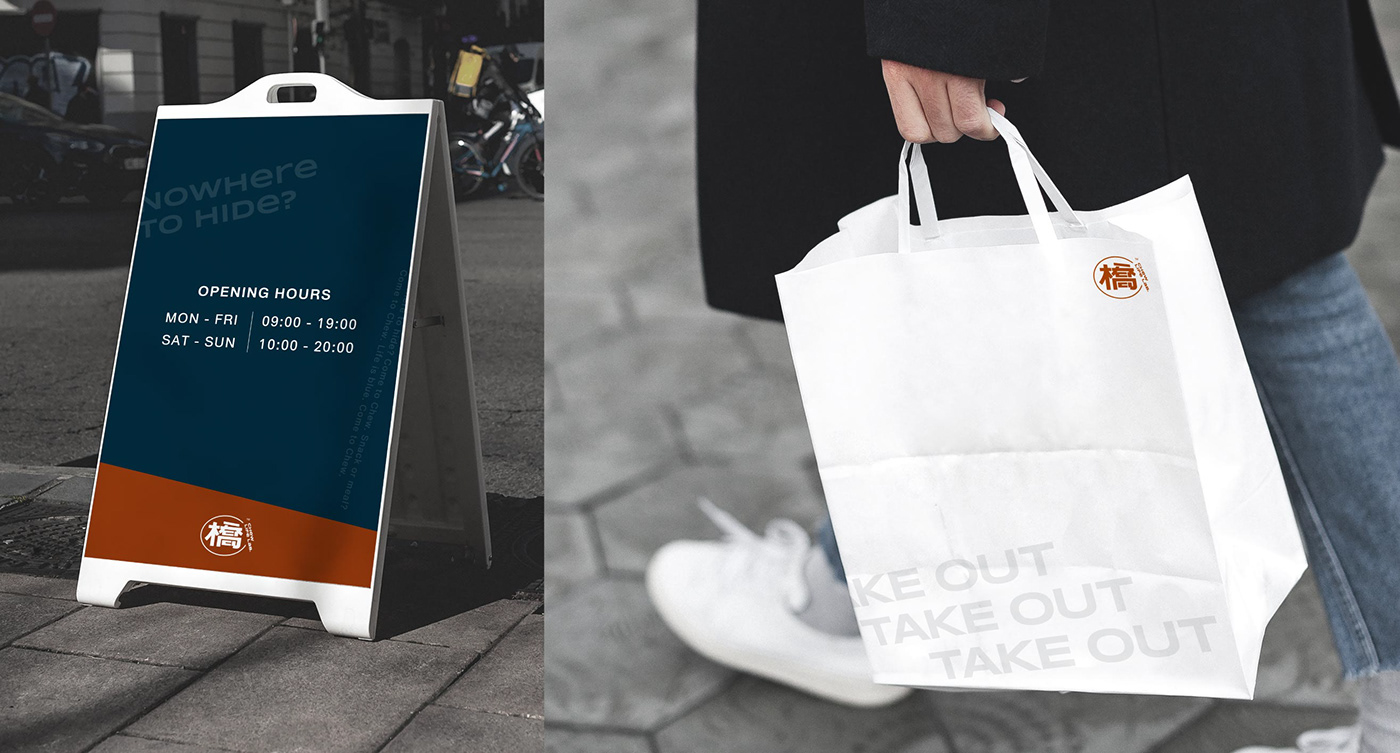
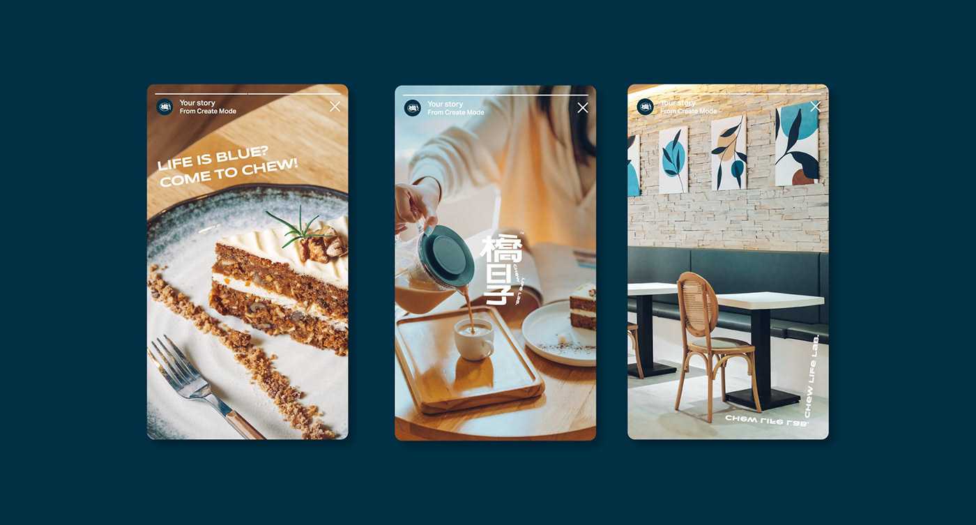
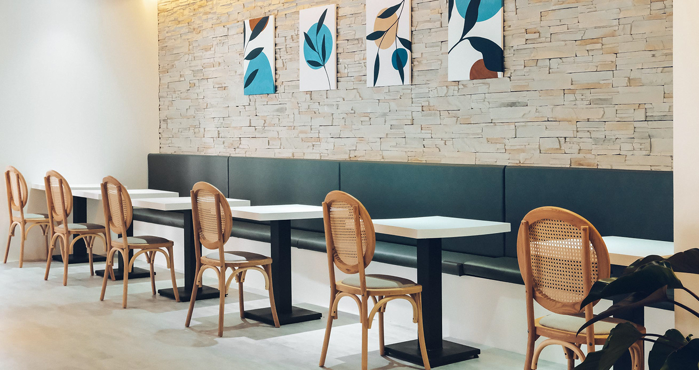
In mandarin, 橋 means a bridge. It also means to make adjustments and to spice things up. The logo of “CHEW LIFE LAB.” (橋日子, literally translates to Bridge Days) uses the imagery of stacked building blocks to convey that idea. With italic logotype, it conveys the brand's humorous and unrestrained tone. Unlike the usual icy cold café spaces, “CHEW LIFE LAB.” uses warm white and embellishes it with shades of dark blue, dark orange, and gold to add warmth and friendliness.
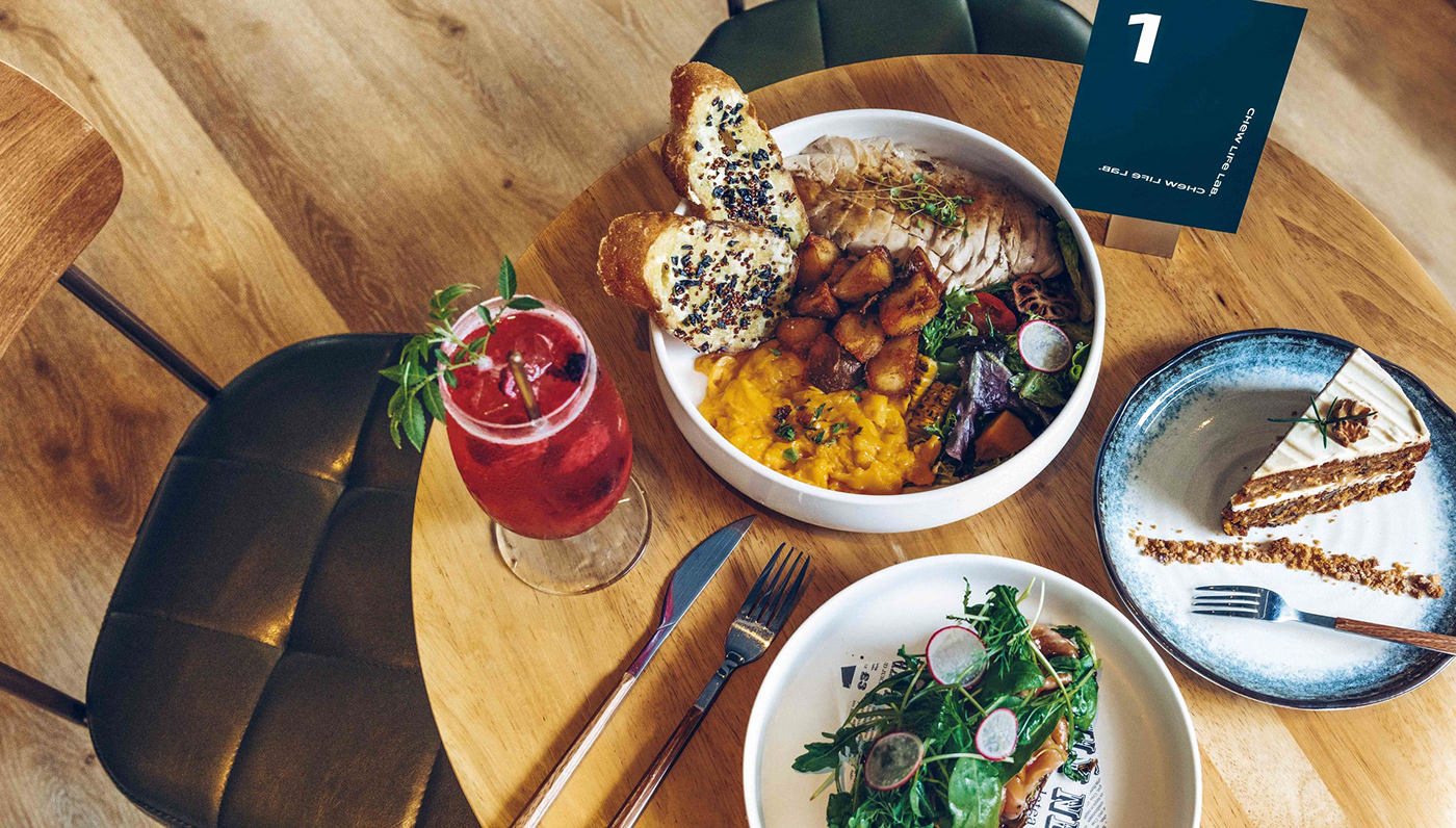
“CHEW LIFE LAB.” has been established in Hsinchu for 8 years. The founder, Ryan, hopes to give every busy soul in the city a sanctuary by creating a brunch spot with unlimited time and no service charge. “CHEW LIFE LAB.” accommodates people from different backgrounds, where people can relax and “橋” their lives.
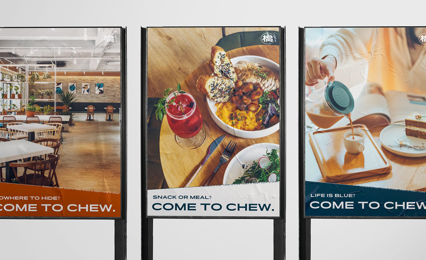
Nowhere to hide? Come to Chew.
Snack or meal? Come to Chew.
Life is blue? Come to Chew.


Credits
Client|CHEW LIFE LAB. 橋日子
Production|Grandvity Design
Art Director|Noodlemaker
Account Director|Grape Chiu
Executive Director|Sarah Peng
Project Manager|Jenny Lee
Designer Director|Si Jia Sun
Logotype Designer|Jasmine Lin
Visual System Designer|Jasmine Lin
Portfolio Designer|Patricia Ho


